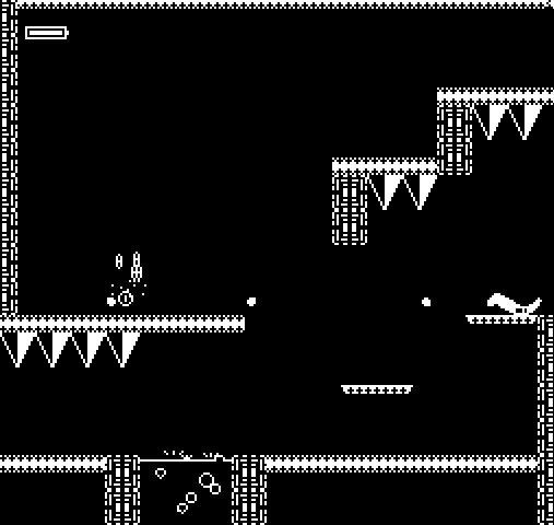
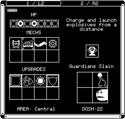
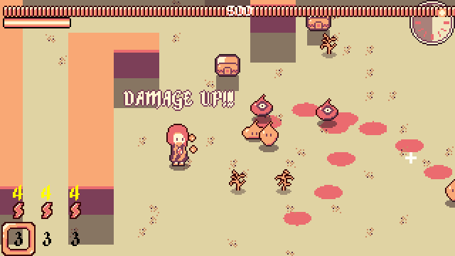
Mech Chip (2019)
Mech Chip is a 2D platformer game with a focus on exploration, action, and adventure. The genre is called 'Metroidvania' because it uses core game mechanics inspired by games in the Metroid and Castlevania series.
Development
In order to focus on learning to code, I limited the colors and set the resolution very low. I focused on mystery and isolation as core pillars of the emotional theme. I never like when games tell me where to go, so instead, I tried my best to nudge players in the right direction throughout a large corridor. I latched onto the excitement and havent let go. I learned that it's fun to develop games, especially if I think they're worth playing.
Features
- Custom Key Bindings
- Gamepad Support
- Player Controller & Finite State Machine
- 100+ Unique, Connected Rooms
- Dynamic Enemy & Boss Behaviors
- Collision Detection & Resolution
- Exploration-based Level Design
- Save & Load Data
- Visuals & Animations with Aseprite
- Sound Design with FL Studio & Labchirp
Tools
Links to Steam

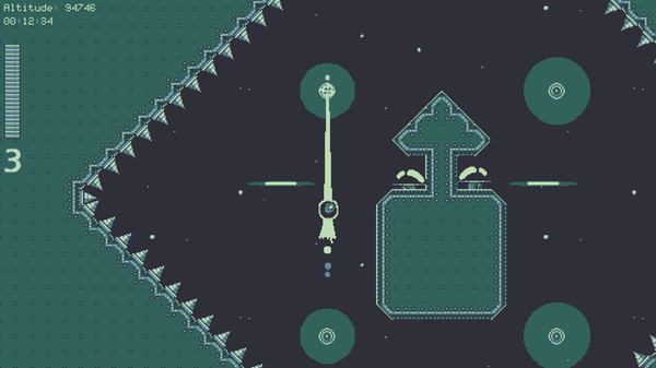
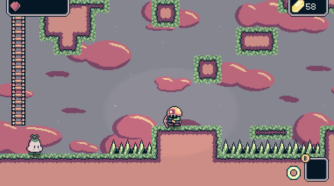
Swing Lord (2020)
I developed Swing Lord between March 2020 and November 2020, soon after trying the Godot game engine. The game is centered around climbing, and the player's tentacle allows them to navigate through each world. I wanted to create a punishing yet engaging experience centered around player movement. Swing Lord was a fun exercise in designing for varied gameplay around a single mechanic. It ended up extremely difficult, but rewarding in my own opinion.
Development
After my fun with Mech Chip, I honed my skills with small demos in both Godot and Gamemaker before tackling Swing Lord. Godot has several capabilities over GMS2, such as vector math, accurate built-in physics, object-oriented classes, and a configurable node hierarchy system. I wanted put my skills to the test right away, so I created a very focused experience. The game is strictly a battle of ascension with fun physics mechanics. I learned to love Godot and have stuck with it well into 2025.
Feature Highlights
- Grappling Hook Controller
- Enemy & Hazard Behavior
- Palette Swap Shader
- Cosmetic Collectibles
- Engaging Level Design
- Saving & Loading
- GodotSteam Utilization
Tools
Links to Steam

Pyjama Princess
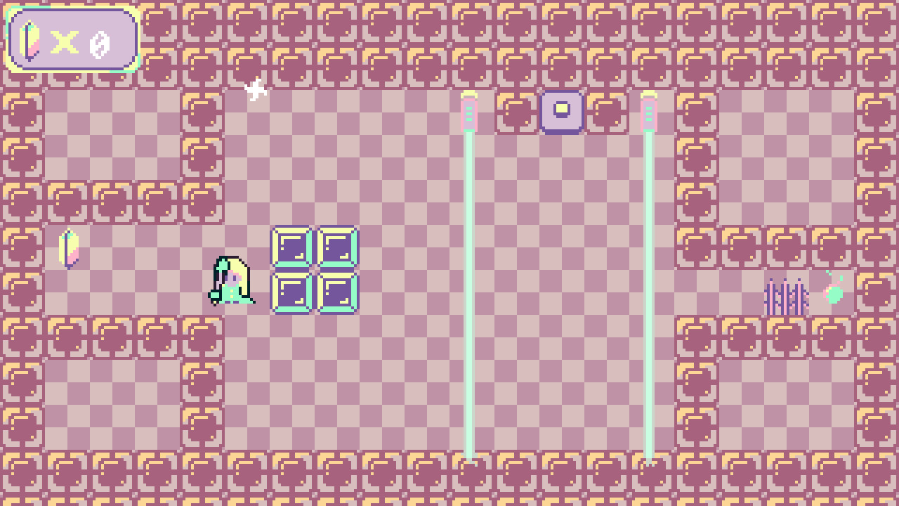
- Block Puzzles
- Top-Down View
- Simple Character Controller
- Keyboard & Mouse Gameplay
Tools
Dessert Desert
- Procedural Terrain, Enemy, and Item Generation
- AI Behavior & Pathfinding
- Action-focused Character Controller
Tools
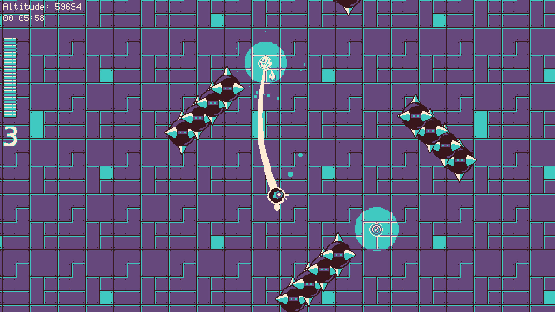
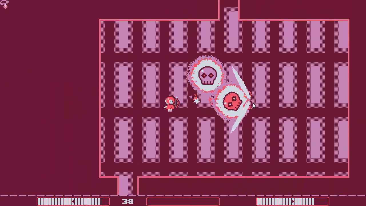
Stellar Veins
- Nonlinear Level Design
- 2D Combat & Platforming
- Dialogue Windows
- Visual Effects, Animations & Shaders
- Collectible Tools & Inventory System
- Save & Load Data
- Background Music & SFX
Tools
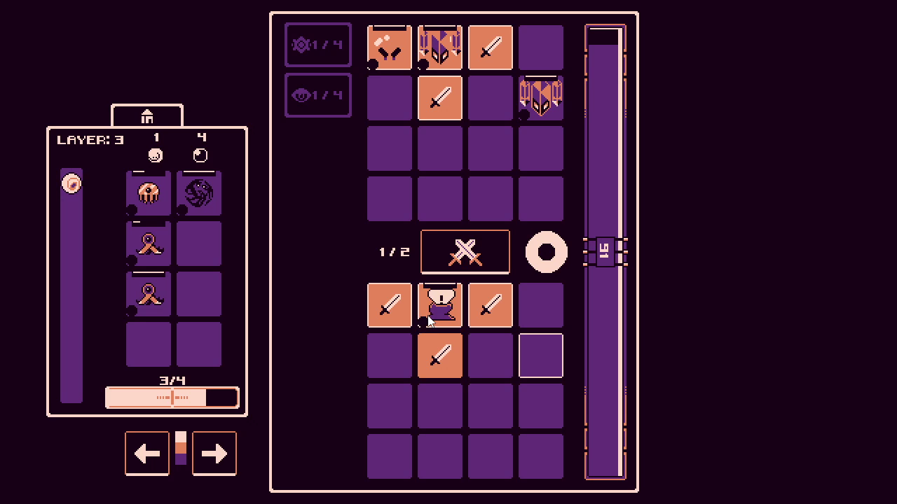
Fairy Roguelite
- Procedural Level Design
- Top-Down Ranged Combat
- Mini-Map
- Spell Casting System
- Visual Effects, Animations & Shaders
Tools
Cube of Cubes

- Math Visualization
- Execution of User Input
- Browser Application
- Inspired by tixy.land
Tools
Online Job Searching
This study sought to explore online job searching behaviors with a mixed-methods approach. Our group conducted eight 1-on-1 interviews with observers, followed by a survey with 38 respondents. Our research aimed to provide insights into user preferences and strategies for job searching when open to relocating, which informs the potential design of job search platforms.
Our findings revealed four main themes: (1) the importance users placed on a binary relocation decision; (2) the importance of job title and location as primary search filters, with users often searching for multiple job titles in different locations; (3) a preference for autofill features to speed up the search process; and (4) a tendency to search by city rather than region.
Contributions
- Surveys
- Interviews
- Live Observation
- Affinity Diagrams
- Personas & Spectrums
- User Scenarios
- Experience Maps
- Design Implications
 View Full Paper
Mental Health App Study
This study aimed to evaluate the usability of What's Up, a mental health support app, using a series of moderated, exploratory tests. Participants performed various tasks via Zoom with screen sharing. There was a distinct focus on app navigation with a research goal in mind. The research team collected quantitative data such as success and failure rates, and qualitative data like verbal participant feedback. A pilot test was performed before recruiting users.
Our findings revealed that users faced difficulties navigating the app due to inconsistent gesture methods, but found configuring the app settings to be straightforward. Based on the results, recommendations were made to improve usability: Provide consistent gestures or image-based instructions, incorporate activity overviews, and use more images in place of text. Additionally, a comparison test with Sanvello, another mental health support app, demonstrated that Sanvello scored higher in ease and enjoyability, providing valuable insights for the future development of the What's Up app.
Contributions
- Moderated User Testing
- Exploratory Testing
- Task-based Assessments
- Heuristic Evaluation
- Quant & Qual Data Collection
- Analysis of Result Differences
- Survey
View Presentation Document
Vision Impaired Users & Kiosk Accessibility
In this study, our group conducted interviews with four individuals with blindness or low vision to understand their experiences using self-service kiosks. We found that locating kiosks, navigating interfaces, security concerns, and a necessity for human assistance are common challenges faced by these users. We ended up concluding that consistency in design, location, and layout of kiosks, as well as improved interfaces, privacy, and security measures could enhance the experience for users with visual impairments.
Key Findings
- Kiosk Familiarity: Consistency in design and location could improve findability and navigation for blind and visually impaired users.
- Kiosk Interface: Providing alternative feedback instead of a visual screen, such as audio guidance or haptic feedback, could greatly improve kiosk usability.
- Privacy and Security: Placing kiosks inside organized spaces, having a trusted person assist, and using headphones are potential solutions to increase privacy and security.
- Assistance: Providing training for employees on accessibility accommodations could greatly benefit blind and low vision users.
Our study was limited by its remote nature and reliance on participant recall. Future research could involve observation of more participants actively interacting with various kiosks, hopefully providing more insight into the challenges in their experience.
Contributions
- Semi-Structured Interviews
- Affinity Diagrams
- Pain Point Research
- Literature Review
- Design Implications
View Full Paper
Itch.io Web Accessibility Report
In this study, I analyzed the web accessibility of Itch.io's homepage and game browser page using various manual and automatic evaluation methods. These included W3's Easy Checks, CSS and HTML validators, ARIA assessment, readability testing, WAVE Web Accessibility Evaluation Tool, and TAW (a web accessibility test). The study found that the Itch.io pages have an unorthodox structure, with gaps in accessibility due to missing alt text, lack of coherent tab navigation, and other issues.
I recommend reformatting the page's structural elements, such as meaningful headers and tab order, and to improve screen reader legibility by properly labeling and creating images within the site. This includes using alt text on all images or finding an alternative solution so that screen readers focus on content titles only, rather than their blurbs and descriptions.
Contributions
- HTML and CSS Validators
- W3 Easy Checks
- ARIA Assessment
- Readability Testing
- WAVE & TAW Web Accessibility Tests
View Full Paper
CRM Findability
In this study, we evaluated user satisfaction, accessibility, and overall effectiveness of CRM Logic's lead page. Our research indicated that users often experienced frustration due to missing information and difficulty locating information quickly. Many users blamed themselves for their CRM system's errors, adjusting their processes to correct these issues. We found that using icons and graphs in our low-fi prototype testing led to more successful task completion, as these visual elements were more distinguishable than tabular data. However, some challenges were encountered during our low-fi and mid-fi prototype testing, such as the high failure rate in Task 4, which we suspect was due to the conflation of Loans and Production.
We initially aimed to optimize CRM system processes but had to narrow our focus to CRM Logic's Lead Page due to limited resources and time constraints. Our participant pool included adult computer users, leading to a broad scope of participants. While our study had some limitations, such as small sample sizes, our efforts led to improvements in the Lead page's usability. Future work should address ambiguities in testing procedures and results, as well as refining the scope of participants to include only CRM Logic users. This would ensure that results directly reflect and impact real users of the system.
Contributions
- Project & Team Management
- Surveys
- Interviews
- Literature Review
- Chalkmark Testing
- Personas
- Data Informed Design
View Full Paper
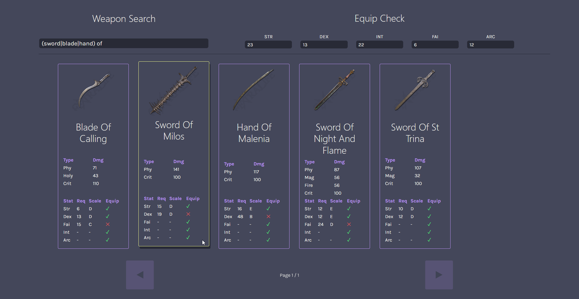
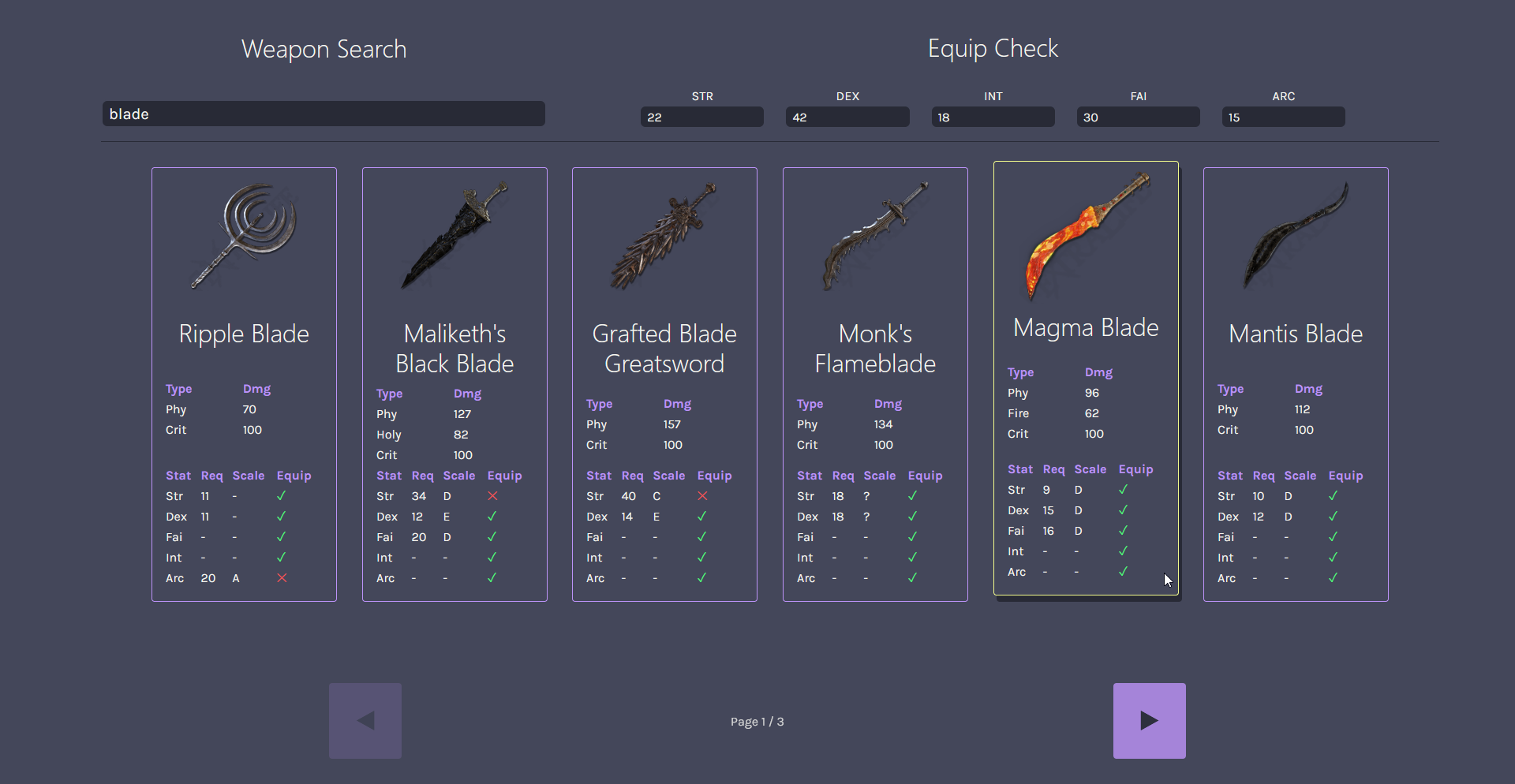
Elden Ring Weapon Search
This project was a fun introduction to Vue, a neat front-end framework. I used an HTTP client called Axios to handle communication with this fan-made Elden Ring API. Understanding how to effectively use the data from this API within the scope of Vue was necessary. A large chunk of project time was spent desiging and implementing a comfortable interface for querying the API.
Capabilities
- Browse Elden Ring weapons (pre-DLC) with a search bar
- View cohesive weapon data on distinct cards
- Input stats to determine usable weapons for your own character
Tools